Showing posts with label Model homes. Show all posts

Wednesday, November 19, 2014

Vintage Glam Master- Get The Look


The vintage glam look seems to be very popular these days, and with the onset of winter, something cool and frosty seemed to be on my mind. Though, down here in Texas, snow and frost is something we hardly see. It is starting to get get cold here, some freak cold front, which in November is really weird for us. So my mind had been stuck on winter mode...with jackets, boots, and the longing for Colorado snow.

That being said, this vintage glam bedroom seemed like the perfect inspiration for a winter-time, bedroom makeover. This beautiful room was designed and decorated by the ladies at Dy Lynne Decor. 


Get the look.....

The two main rules for bringing a room like this together are....keeping it neutral, and mixing textures and patterns.
Most of the colors in this palette, are in the khaki range, with touches or creams and blues.
There is a wide variety of fabrics here, from a burlap on the chairs, and linen on the headboard, to a silk on the window shade. Mixing them keeps the room from feeling to simple.


For the glam part of the look, different types of metals, and glass were used. 
Two small, antiqued gold, and crystal chandeliers were hung over each nightstand. This is wonderful way to really make a statement. These were hung directly on the ceiling, even with the slope, they hang nicely. You want them to sit just off the wall. 
You could also add sconces directly to the wall, but you would loose the size, and the walls wouldn't seem as tall.


Here is a budget friendly chandelier from Wayfair, at only $99.
 
CBK 4 Light Candle Chandelier From Wayfair 
The light in the center of the room, is a smaller, understated chandelier. You don't want to go to big here. Just enough to tie in with the room, and give you light. But not to big, as to draw you attention away from the focal wall. 


Here is an alternative to the ceiling fixture. From Shades of Light, at around $397, it isn't very budget friendly, but it sure is beautiful. 
 Vintage Modern Gold and Crystal Mini Chandelier
Vintage Modern Gold and Crystal Mini Chandelier from Shades of Light 

On the back wall, is a beautiful wallpaper! It has a light gold, shimmered backing, and a cream hand painted looking design. This is the main focal point of the whole room. It is soft, and simple, but makes such a statement. 


Since the gold base is not shinny, it wont create glare, just a soft shimmer, and glow from the chandeliers. No art is even needed above the bed here.  


Unfortunately, this is not a cheap product, and with all the texture, not easy to apply. 


To get a similar look, you could try using a stencil. Here is an all over stencil that could be used over a soft gold color. Adding a bit of plaster, or smooth texture paint (a heavy textured paint, similar to a light plaster) to the cream paint, will help thicken it up, and give you this textured look.

Anna Damask Stencil by Cutting Edge Stencils

On the opposite side of the room, is an antiqued dresser, in a white tone. A large mirror helps open up the space, and more glass and different colors of metals are used in the decor.


The linen duvet with ruched trim is from Pinecone Hill, but is no longer available. A simple linen duvet can be adorned with lace or ribbon to get a similar effect. Mixing patterns, textures and layers helps make this bed cozy, and inviting. I love the blue-grey distressed headboard, it's the perfect compliment to the linen.


Since the bathroom is open to the bedroom, the decor and color palette was carried through. 
The gold and crystal scones, are the perfect touch of glam. Bronze, silver, and mercury glass are all mixed in here.


Room designed, and decorated by Dy Lynne Decor.  
Be sure to check her out on Houzz, and over on  Facebook. 


Sunday, October 12, 2014

Color Me Beach-House Blue


I'm so excited about today's Color Me! If you haven't seen these before, I will be bringing you these "Color Me" posts, a couple times a month. The goal here, is to show you helpful ways to incorporate color into your house, with paint and decor. Color can be scary for some, others just need some tips on refreshing what they already have. There will be all sorts of color palettes, so if this one isn't for you, check out the others Here, and be sure to follow along for all the upcoming palettes.

  I love blue, and love all things beach, so this is my kinda house! This beautiful model home, was of course designed, and decorated by the awesome ladies over at Dy Lynne Decor. I know you hear their name all the time you guys, but this is what they do, every month, of the whole year....how awesome is that, dream job!

Beach themes seem to be really popular right now. You can search it on Pinterest, and be there for hours, getting lost in the worm hole. So lets dissect this room, and this color palette, and see why it's so popular?

All colors by Sherwin Williams

I think one of the main reasons that people decorate with a beachy theme, even those far away from the water (like me), is for it's calming nature. This color palette isn't loud, and it isn't overwhelming. Even if your not a big fan of the beach, this set of colors can work well with all sorts of decor styles. 

For the base paint in this living room, something like "Rhinestone", by Sherwin Williams, is a good starting point. This is a light grey color, with a warm undertone. Keeping the base light, lets you build brighter, and darker colors on top of it. White, is also a good fresh base, but to break away from the super simple, try and slight change in tone. Grey's can be a tough one, like white, they tend to lean towards another color. Like a green-grey, or blue-grey. So when your picking your grey, place it next to your other room color swatches, and see which way it pulls. If your room has more blue, go with a bluer-grey, or a white-grey.

The sofa, being the biggest piece in the room, is kept a light color, similar to the wall. Keeping all of the big pieces in the same range, ensures the room will be soft, and flow. A darker piece would have been to heavy in this room.


For all of your colors in a palette like this, warm undertones are best, these are colors with a yellow base and not blue. If that sounds confusing, check out my post, 6 Tips For Picking the Perfect Paint Color, I dive into cool and warm colors there.  When your working with the blues, a cool undertone color, can really take on a pastel look, and wont look as soft when finished.

The next two colors in the palette, "Folkstone", and "Burlap", are good for grounding pieces. For instance, a rug, curtains, smaller furniture pieces, and medium sized fabric choices (like chairs and large pillows). Since both of these colors are earthy, and neutral, it will be easy to find things with texture and patterns in these tones.  A large woven area rug, helps to ground this space, and brings in good texture. The coffee table and side tables are just a shade darker. Going to dark here, will make the room look uneven, and piecey. 


The last three colors in the palette, "Rainstorm", "Rain", and "Tame Teal", are the accent colors. These colors are used in the art, pillows, chairs, and accent pieces. For the pillows, they used several patterns, and and pulled in all the tones from the color palette.
 Simple, white coral shaped lamps adorn each side table, and a collection of ocean inspired decor is grouped on the coffee table. Keeping just the accent pieces in the colorful tones, makes it easy to change colors, and styles as you like. 


This piece, in a niche across the room, brings in more texture and pattern. 


This kitchen and dining space, are open to the living room, so the color is carried through here as well. Kitchens can be a tough place to add lots of color. There are many big grounding pieces, that you can't change, like the cabinets, back splash, and counters. Adding color in seating, and accents, is a simple way to give that pop of color you may need. 


Using colorful plates and napkins, against your neutral colored surfaces, can really add a punch of color. These plates, and simple pieces, can be switched out as your taste changes, or with the season. Decorating for fall, or Christmas would be such an easy transition here, as none of the accent colors are used on large pieces. 


There is also alot of texture in these rooms, which softens all of the hard surfaces. Natural fiber rugs, linen curtains, rope accents, greenery, and textural wood pieces, all pull this space together for a cozy look.


 I love this art piece, it has so much texture, and it works perfectly with the color palette.


Here is another space in the house, that follows the same rules. The walls are in the same base paint (Rhinestone), and are broken up with a white bead board accent on the bottom. Since this room is alot smaller, it can tend to get dark, even with a light color on the walls. Using a white on the bottom half, helps to make it look larger and brighter. You could use also use a ship lap, a board and batten, or stop the wall color with a piece of molding just above the chair rail height.


 The chairs and table, use the same mid-tones from the palette (Folkstone, and Burlap), and the accent colors (Rainstorn, Rain, and Tame Teal) are also scattered around the table, and in art on the walls.


I just love this house!!
 I hope you loved it too, and that it gave you lots of inspiration, and ideas about how to use color. Don't forget to check out my other Color Me palettes.  Be sure to stop by Facebook, and check out Dy Lynne Decor!

Until next time.....


Friday, October 10, 2014

How-To: Stripes With High Tech Tools

Earlier this week, I showed you how to make stripes the old school way. Today I'm going to show you a shortcut with high tech tools. If your doing more than one wall, this is such a time saver!


This is a Dewalt Self-Leveling Line Laser. I know, it sounds pretty fancy, but if you are a
do-it-yourselfer, this is a must!
Using this awesome tool, will save you from marking all the lines, all the way around the room. It's also useful if your doing a large series of stripes on one wall.
There are several mounting options, which include different kinds of tripods or mounting tools. The coolest thing is you don't need all of that, it has a magnetic pivoting bracket on the back, so you can just attach it to a ladder, or any metal surface.  


.

Here is how it works, on the side of the tool, there are two buttons...

One for a horizontal line.


One for a vertical line


The really cool thing, is that you can have them both on at the same time. If you were marking out squares or diamonds, this is a must have tool!! This would also help with hanging a gallery art wall, or even getting curtain rods hung straight. 


Even if your surface that you are placing/or attaching your level to, is not level, the tool will self level, even if it is bumped. Love that! 


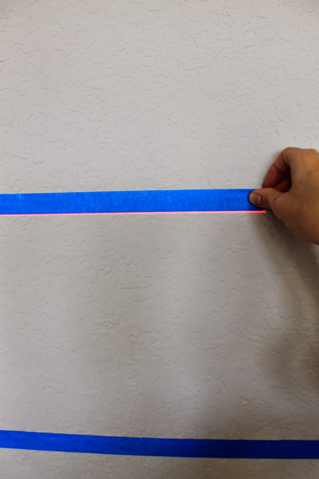
Here is what I did for this set of lines. I just sat the level on the rung of a ladder, the red laser line flows around a good portion of the wall, even around curves and corners!


Then, with no marking or measuring, I followed just above the line with the tape. This helps to make sure you are right on the line, and not over the spot you should be. 


I used this same technique all the way around the room, to mask off my three stripes. SO super simple. I just rotated the ladder for each wall, or area, and it leveled right back up each time. I could even get the laser line to bend around these tricky corners below!


Here it is, all taped off.
You guys...this whole part took me under 30 minutes!!!
Normally in a room like this, I'm measuring, marking, and taping all three stripes for well over an hour. 
For help on how to paint stripes, and the best way to get a clean line, be sure to see the previous post on "Stripes The Old School Way".


The final product, two colors, and three stripes, in the game room. This creates a nice flow around the room, and helps pull this large space together. You could use your favorite teams color here, or give it a punch with a brighter color for a more kid friendly space. 


Dy Lynne Decor designed and decorated this fun area. 
  This would be such a great hang out for teens, or the perfect spot to watch the game. 


I love the pool triangles display. They sprayed some of these pieces, to add more color.


Swivel chairs, and a side table make this space cozy.


On the other side of the room, is a wood bar, and a set of bar stools. 


So there it is, stripes with high tech tools! 
Super easy, and at around $150 at Home Depot, it's a great deal too!
Unfortunately for this project, I borrowed mine from a friend :( 
But this is definitely on my Christmas list! Go get one!