Showing posts with label picking a paint color. Show all posts

Friday, October 10, 2014

How-To: Stripes With High Tech Tools

Earlier this week, I showed you how to make stripes the old school way. Today I'm going to show you a shortcut with high tech tools. If your doing more than one wall, this is such a time saver!


This is a Dewalt Self-Leveling Line Laser. I know, it sounds pretty fancy, but if you are a
do-it-yourselfer, this is a must!
Using this awesome tool, will save you from marking all the lines, all the way around the room. It's also useful if your doing a large series of stripes on one wall.
There are several mounting options, which include different kinds of tripods or mounting tools. The coolest thing is you don't need all of that, it has a magnetic pivoting bracket on the back, so you can just attach it to a ladder, or any metal surface.  


.

Here is how it works, on the side of the tool, there are two buttons...

One for a horizontal line.


One for a vertical line


The really cool thing, is that you can have them both on at the same time. If you were marking out squares or diamonds, this is a must have tool!! This would also help with hanging a gallery art wall, or even getting curtain rods hung straight. 


Even if your surface that you are placing/or attaching your level to, is not level, the tool will self level, even if it is bumped. Love that! 


Here is what I did for this set of lines. I just sat the level on the rung of a ladder, the red laser line flows around a good portion of the wall, even around curves and corners!


Then, with no marking or measuring, I followed just above the line with the tape. This helps to make sure you are right on the line, and not over the spot you should be. 
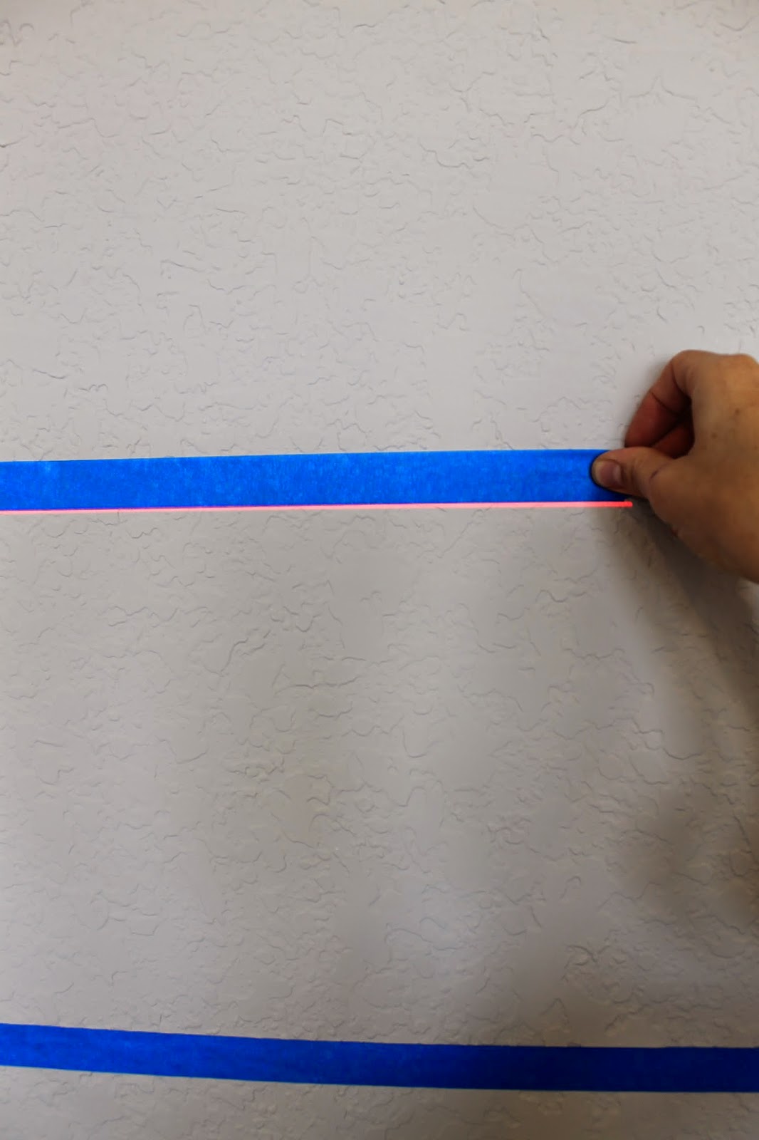

I used this same technique all the way around the room, to mask off my three stripes. SO super simple. I just rotated the ladder for each wall, or area, and it leveled right back up each time. I could even get the laser line to bend around these tricky corners below!


Here it is, all taped off.
You guys...this whole part took me under 30 minutes!!!
Normally in a room like this, I'm measuring, marking, and taping all three stripes for well over an hour. 
For help on how to paint stripes, and the best way to get a clean line, be sure to see the previous post on "Stripes The Old School Way".


The final product, two colors, and three stripes, in the game room. This creates a nice flow around the room, and helps pull this large space together. You could use your favorite teams color here, or give it a punch with a brighter color for a more kid friendly space. 


Dy Lynne Decor designed and decorated this fun area. 
  This would be such a great hang out for teens, or the perfect spot to watch the game. 


I love the pool triangles display. They sprayed some of these pieces, to add more color.


Swivel chairs, and a side table make this space cozy.


On the other side of the room, is a wood bar, and a set of bar stools. 


So there it is, stripes with high tech tools! 
Super easy, and at around $150 at Home Depot, it's a great deal too!
Unfortunately for this project, I borrowed mine from a friend :( 
But this is definitely on my Christmas list! Go get one!

Monday, June 23, 2014

Checkered Niche Wall Treatment

Niches can be hard places to decorate. Some times they go to the floor to ceiling, and sometime they are only a few feet tall.
So what do you put in them?
How do you paint them?
I have painted many niches in my line of work, and today I wanted to show you a fun, and colorful technique.
This faux treatment would work really anywhere, on any type of wall, and in any color.
In this room, this space was a blank hole. This is the perfect opportunity to add a real punch of color, something that really makes a statement. Since the niche is only a small portion of the wall, you aren't really committing to a giant wall treatment.
Keep reading for the full how to, and be sure to check back for more nice ideas over the next couple of weeks.


How-To
To start, I painted the niche in a chartreuse color. You can pick any color here really, but use something that may not be in all of your decor, something that will pop.
Next I measure off the space, marking 6" squares. I went ahead and added the tacks, at all of my intersection, to keep track of my squares.
Then I taped off the sections I was going to be painting. I added a small piece of blue tape to the inside of squares I wasn't painting, just to keep me on track, when your right up on the wall you can easily loose track of where you were. 


For the finish on the checkered squares, I tinted a metallic plaster to match the color of the base paint. This is a tone on tone checkered look, so I kept them both in the same color.
 The metallic plaster I used is from a specialty faux paint store. For something similar at you local paint store, try Sherwin Williams Quartz Stone. This material can be tinted in  many colors.
For a tone-on-tone look, start with the plaster color first, and match a base paint to the plaster. They can even custom match your paint to your plaster in about an hour.

The material is basically a very thin plaster, with a metallic glimmer to it. You can also add a bit of water for a thinner version, but it is pretty easy to work with as is.


I use a flat trowel like this one, mine is a faux finish trowel, and has curved edges, but for this project your working in such small areas, this wont make a difference. For bigger surfaces, takes a sander to the edges of the trowel, to curve the edges. The sharp corners here, tend to leave lines on plaster finishes. 
Kobalt 7.5-in Midget Trowel
Kobalt 7.5" from Lowes
Use small amounts of the product each time. Putting it on the edge of the trowel will give you the most control. 

Start at a corner, a sweep across each square. Don't worry to much about the application. Once the square is filled, go back over with the whole thing, with edge of the trowel to smooth it out. Keep the rest of the trowel just slightly off the wall, you don't want it flat on the wall. See the photo below.

The finish will have a little texture when finished, it's not meant to be perfectly smooth, so its hard to mess this one up. 

Then just remove the tape.


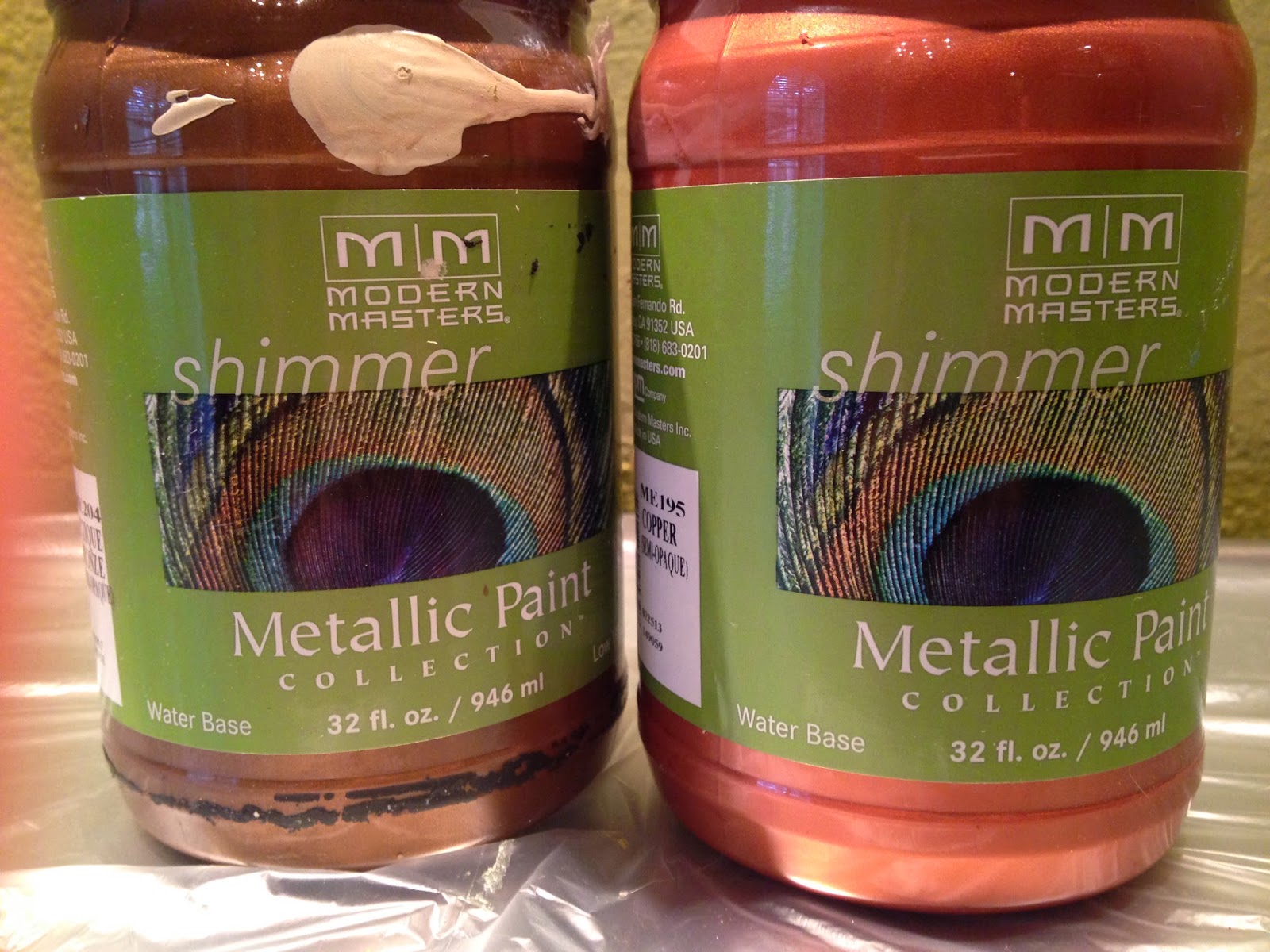
For the tacks, I wanted them all to be in a antiqued copper color, so originally I painted over all of them, since they didn't match. I used two colors of Modern Masters Metallic Paint, in Copper, and Statuary Bronze

You don't need much of this, even some small tubes of acrylic paint would work.

I mixed a little of the bronze with the copper.

Using a small brush, I covered the surface of the tack.

You may need two coats, depending on the color of the wall, or the tack you are using.


Pretty simple technique, you could do this on a larger scale, like on a full wall, or in a bathroom. 

As for the color, this may not be your preferred shade....use something softer for a more glam look, like a gold on gold. For a modern space, you could even use shades of white. This metallic plaster is so gorgeous in red, if your willing to go that bold.


In this room, there were fun pops of color all over the place. The color for the wall, and treatment were chosen form the this beautiful burnt velvet sofa fabric.

The metallic plaster when dried, has the same sheen as this velvet, very multi-dimensional. It was the perfect addition to the room.


The home owner hung this beautiful art piece in the niche. I painted the frame to mach the tacks. I love how he hung this. It was anchored to the center of the niche, so it sat away from the wall. It almost looks like its floating. Much more intriguing than sitting flat on the wall. The can lights were placed behind this, so the wall glowed. Not easy to get pictures of though. 


Don't be scared of the color, do it in whatever works for you, and don't be scared of the finish. 
Try new techniques and materials out, you'll be so proud when your done!!!

Ill be showing you some other fun things to do with niches over the next couple of weeks, so be sure to check back.

Monday, March 3, 2014

Color Me- BOLD


So I'm staring a new series here on The Ragged Wren, called "COLOR ME".  The plan is to bring you helpful ways to incorporate color into your house, with paint, and decor. You should see these color me posts, a couple times a month. Now I know that some of you are scared of color, and that's ok. Others prefer the more neutral palette, and that's ok too. For everyone though, there will be inspiration, which you can apply to everything in you home, from bathrooms, to kitchens. 
Keep in mind that most of the homes I will be showcasing on here are model homes, done by my gals over at Dy Lynne Decor. I know your home may not look anything like these perfectly presented homes, and you may not be able to afford half the stuff in it (heck I can't), but you can pick up tips and tricks, to pulling in a little bit of color, or a whole lot!! 
Keep an eye for these posts, I'm sure to get to a palette that you will be wild about. 
Not sure what your looking for quite yet? "Pin" these photos, and start your own color inspiration board on Pinterest. Be sure you check out my Pinterest boards as well, for all sort of ideas.  

Now onto some color!!!

Color Me Bold
Bold, can include a lot of different color palettes, but this week I'm looking at mixing oranges and blue together. Now for all my family and friends back in Colorado, don't get to excited here...we aren't talking Broncos, and no horse heads will make an appearance.
Design by- Dy Lynne Decor 

In this room, you will notice that while there are lots of pops of color, they all flow well, and create a cohesive look.  When going for a bold color palette like this, there are a couple of things to remember...
1. Start with a neutral base paint. Here a soft tan color was used, like "Alchemy" by Sherwin Williams. You don't want your walls to be the center of attention, you want them to flow with the rest of your space. 
2. Scatter around the colors. You'll notice in this room, you don't see just one color in any large area. Using a bold fabric color on individual chairs, and not on the large couch, brings in the deeper blue, without it being overpowering. Bringing in blue and orange pillows throughout the space (including on the fireplace), also helps break up the color, and carries it around the room, giving it a comfortable look. Notice that no space in the room is completely filled with color, but all the areas have a bit of one or both of the colors, even the fireplace.
3. Change up the tones of the color. When shopping for decor and furniture, look at all ranges of blues and oranges, you shouldn't be buying just one tone. Using only one tone, will make the room seem harsh with color. In this room, you will see that the large armoire piece that is against the wall, is substantially lighter than the chairs. If this piece were dark, the room would feel weighted to that side. The rug is also a brighter and bolder shade of blue than anything else in the room. Notice that the art above the fireplace, carries in a very soft, warm shade of blue and orange. Even the neutral part of this palette, is in a range, a creamy colored sofa, white upholstered ottoman, and tan walls. The rock also helps carry on some darker parts of the neutral palette.
4. Mix in patterns and textures. Iv'e said this before, and you'll probably hear me say it a hundred more times, but its is so important! This is what really make any space fell warm and cohesive, even with cool colors. Having different textures throughout this room, like in the rock, grass cloth rug, nubby linen blue chairs, antiqued blue armoire, embroidered pillows, and wool blanket, all make this room feel softer, no matter their color. Having different types of patterns, will give you an eclectic look, like something that was found over time, and pieced together. They don't all have to match any specific style, unless your going for a super themed type of room. 

Here is another space that brings in this same concept, but using more of a coral-orange, and a navy. This space is in more of the warmer fall tones. 
Design By- Dy Lynne Decor
Maybe you already have the base for a room like this? 
Adding in some easily changeable items, like rugs, pillows, and table decor, make it a quick change space. Decorate with the seasons, or as you sway between color palettes. It's easy to do, if your bigger pieces stay in a simple, neutral palette. 
If you are addicted to decorating like me, this is the perfect solution! 

All the colors shown here are Sherwin Williams colors.


Need more inspiration?
Check out these other Blue & Orange decorated rooms...
Better Homes and Gardens
Tracery Interiors
Palmer Weiss
Jessica Kelly Design