Friday, November 29, 2013

Reserve At Old Fredericksburg Model Part 2


Hi all, hope everyone had a wonderful, and restful Thanksgiving with your families. Ours was quite, well nothing with two small children is ever really quite, but it was nice!
Lots of food, and lots of clean up!


Here is part 2, of the Reserve at Old Fredericksburg model home.....The rest of the first floor.
If you missed the first part of this model, decorated by Dy Lynne Decor, you can see it here.

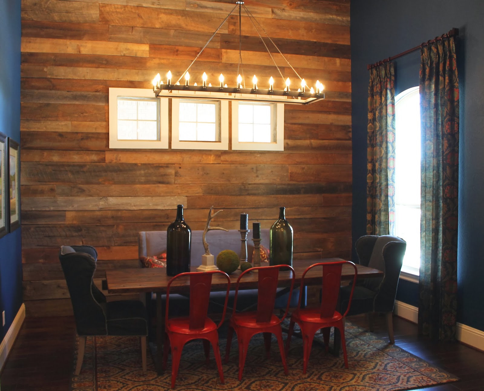
The kitchen, living, and breakfast area in this house, are all open to each other, I love the flow of this. It makes a great space for entertaining, everyone can just gather.

In the living room space, there is a beautifully aged leather sofa, an armless chair, and two small bench seats.  The leather sofa, it's such a timeless piece, this piece will be in style for years. A simple leather sofa, can tend to look a little masculine, the tufting here, helps tone that down.  

An armless chair is a great way to add more seating, without taking up alot of floor space. This chair is slip-covered, so it looks simple and effortless. 
The pillow even matches the wallpaper from the entryway (see here).
I love the wall art set up here, it doesn't have to be predictable. You can create a gallery wall with what ever you have. The golden animal bust, is the perfect topper to balance out the color on this side of the room, and brings in another material and texture. Adding objects that are three dimensional, helps add interest to a grouping like this as well.

Here is the dresser piece before, unfinished wood.

 If I can get my hands on an unfinished piece, that is ideal, but you could paint a similar treatment on a salvaged piece of furniture. Changing out hardware, will update a piece as well. Here, an aged brass cup pull was used, but an oil rubbed bronze would work well too.

The rug is wool, and the heavy pattern really weighs the room down. If you start with a heavy busy pattern here, you can bring in all sorts of patterns around the area, and make it look cohesive. This also gives you a larger color pallet to work with. 
The small bench seats could be used to kick your feet up, or as additional seating. These are covered in an animal hide.  

Dy Lynne did such a great job in here, mixing all sorts of texture and materials. If you have to much of one in any area, the room starts to look heavy, and unfinished, this room has a great balance. 


The pillows on the couch mix in more textures, and great patterns. 


In this beautiful kitchen, the cabinets were painted in a deep gray tone. The stainless steal, brick walls, and wood floors all balance this room out. Grey can tend to be a heavy dark color for cabinets, and the counters are very rich in here too. But with the right lighting, adding glass front cabinets, and mixing the elements, this kitchen feels very open and fresh, and has a style that isn't easily dated. You can add pops of color inside the cabinets with dishes, or in the decor on the counter tops. 


Te large island is the perfect spot for the kids to eat breakfast, and great when having a party, using it as a buffet. The stools bring in the bit of the industrial feel to the mix. 


The breakfast area is just off to the side of the kitchen. A four top table is used here, but there is plenty of room for a bigger table, for a growing family. 

The light fixture here, is so unique. It was picked up at an antique show, where it was custom made. I love the mixture of the metals, with the heavy, thick rope.


This cute little decorative crown, doubles as a napkin holder.

Just to the side of the kitchen is a special little area. 
This room could have so many uses. 
For this house, they used it as a sitting room, perfect for grabbing a cup of coffee, and reading a good book by the fire. 

There are four small leather chairs, gathered around a custom coffee table. 

I'm not sure what this piece was in a former life, except yummy vintagey goodness! It has such great character, and a gorgeous coat of cream chippy paint. 


There is another custom piece of lightning hanging in here. Very unique, and it brings the industrial feel to the mix, in this room.

On each side of the fireplace, is a deep niche with built in cabinets, and shelves.

On the back wall of these spaces, I used a special paint treatment. See the how-to HERE.

The pattern has little birds, and you know how I love my birds! 
My cute little kids made it into a frame here. 


On the back side of the sitting room, is the mud room and the entrance from the main garage.


Laundry rooms tend to be boring, and since its's a space your in alot, why not make it look nice. Over the washer and dryer, a counter was installed. Its the perfect spot for folding and storing laundry supplies. I think this space gets overlooked so easily. Even a piece of butcher block across the top of the two, can unify the space. 

On the wall I painted a simple quote, in a charcoal grey, just in case you kids need reminding.

Next to the washer and dryer, is a built in work area. The door to the driveway, and detached garage is right here, so it makes it a great spot for items you need to grab when your on the go. This one was turned into a wrapping station. If you have it fully stocked, you'll always be ready. 

A shelf held up with old corbels is a good place to display useful items, it doesn't always have be a decorative piece for it to be beautiful. Use ribbon, twine, bags, scissors in a jar, and a tubs of paper, as pieces of art.  


Here is the view form the back of the house. There is a very large deck up stairs, and a covered area with a full kitchen downstairs. 


I love how they kept all the oaks in the backyard. It creates the perfect entertaining area. There is a flagstone patio, and a fire pit in the center.  


So that's it for the first floor.
Check out part 1 of the model, if you missed it, HERE, the rest of the first floor.
Next I will show you the upstairs, including the kids rooms, and an awesome loft area.

Dy Lynne, with Dy Lynne Decor, and her amazing team, pulled this amazing model off in just days!
Check out some of her other work here, and see her on Facebook here.

See some of the other models I have work on with these ladies, here, and under the models tab at the top. Lots of inspiration!

I know this is a model home, and it's perfect, but I think you can implement so much of this in your own home, and in your spaces. From the mixing of materials, to the placement of furniture.  Try working with what you have, but using it in new ways!!

Monday, November 25, 2013

Reserve At Old Fredericksburg Model Part 1


So, I've shared with you quite a few model homes in the past (you can see the them all here). 
Iv'e told you how much inspiration I get from them, which usually leads to me going home, and redoing a room in my house....Yikes, expensive! 
The ladies I work with on these, at Dy Lynne Decor have done such and amazing job at planning and finishing out these spaces. I love their style. You should see Dy Lynne's house..Built by her husband, who's a home builder/remodeler, and decorated by her, what an awesome combination. 
I hope I can show you her house sometime soon!
I told you before how hard it is, not to get the "wants" when I'm working in these houses...and mentioned one house in particular, that I fell in love with....I want everything in there. I even talked her out of a couple items I had to have...I'll show you how I used those, in my own house, another time. 

  I think I really like the look of a model when it's done for so may reasons, but mostly because they help you see the possibilities. When it's your own house, you have so many limitations...child proofing, location, budget, color scheme,  style differences (in other words- husbands opinion), space, and did I say budget. 

I think when you buy a house you have big plans, all these dreams for what you can do to the place. I know I am constantly dreaming up new plans for my house...I need to get off Pinterest! But after finally unpacking all the boxes, you realize you can't just start over fresh, you have to work with what stuff you have, what budget you have, what time you have and what knowledge you have...which is when you get back on Pinterest....and dream. 

I think decorating can be so hard for some people. My friends are always telling me how hard of a time they have making it all work together. If you have the opportunity to start fresh, sell it all, and by new stuff, that's awesome, but not the case for most. 
Design style has changed so much over the years, believe me I still see some of the stuff from the 80's in client's homes, and you know it's outdated. But I think an eclectic mix is just the thing for most people..it's budget friendly, and it will last for years. It's also easier to change little things with out having to start all over. Now, all the woods don't have to match, you can mix metals, and prints, and really bring in several types of design styles in one room. This is why I'm so drawn to what these gals do... they still have a budget, and it isn't huge. It sounds like alot, but if you add up the cost of all the furniture and decor in your house, you'd be really surprised how much you have spent.
I think most of the things they use are obtainable, they aren't in you box store, they are found everwhere. From the antique shows, to Target. 

Take a look, and be inspired. 
This house is so awesome, that I have to show you in more than one part... to much good stuff.  I'll start with some of the downstairs. 


This a Gehan Home, and one of their biggest models yet. It has a great open floor plan, and tons of space.


Entryways, they should be special, whether its just a hallway, or a grand open room...you need something to look at, something to set the tone to the rest of your house. Heck, mine has an 8ft Sailfish hanging on the wall.
Here is the grand entryway...There are two large niches when you walk in. 

The lower niche back wall, is covered with a beautiful wallpaper. It is colorful, and has a vintage flare. They used a tall bench seat in the space. It's paired with the perfect pillows and a great, bold pop of color with the red lantern. The hooks are perfect for hanging coats or hats. But in reality, we all know that if this were a real house, the coats wouldn't be hung up, they would be thrown on the bench, along with 10 pairs of wet and dirty shoes on the floor, oh reality!


The top niche is way up there, I think most people would ignore it in their own homes. But this is the perfect space to add color, or a drama. It draws your eye up. Which, if you have and entry way like this, you have to to do!


 I faux painted this niche with a charcoal grey, and a rusty brown.
I know it looks high, and it most certainly was...Mom don't look.


To the left of the niches, is a great curved staircase, I see a giant Christmas tree here for the someday owner of this house. 

This small table is perfect for changing up your decor. It's small enough not to have to spend alot, but gets enough foot traffic to be enjoyed.  You could have different chach-skies for each season here.

To the right of the niches is the most amazing dining room yet! I love old wood, I would use it all over my whole house if it weren't so expensive. 


They paired the textures and elements so well in here. Nothing over powers the other, even with a giant wood wall. Most people would be scared o use a wood top table here, but the base is steel, and it really breaks it up. The banquet is a grey suede material, but with crisp simple lines. With the neutral solid color, it makes it easy to change up the pattern or color on the pillows. 

The chairs at the end of the table are a slip covered grey cotton, I love how they look like they are inside out. These would be so easy to make, and you don't have to worry about being perfect here. 
The other three chairs are red metal tub chairs, you have to bring in the metal element, and why not be bold, and do it with color.

 The table decor brings in two more needed  elements, you have glass, and greenery, with the moss balls. 


But my favorite thing in this room,  of course is the wood wall. They used several sizes of reclaimed wood. This is the good stuff, of course, but you could....use old fencing like I did here, or use new wood, and make it look old wood (see my how-to faux reclaimed wood here).


In the hallway to the living room is a great little wine room. It is only about 3.5' wide...but it has a glass door which gives the effect of being bigger. So not to completely enclose this room in, we only faux finished part of the door. 
I hand painted the letter "G", in reverse, onto the back of the door with black paint. Once it was perfect, I taped off the middle section and used a frosting spray on top. This would probably not be the most kid friendly way to do this, shows little fingerprints. 
This way you still see whats in the room, and how beautiful it is, the letter and frosting, makes it look more refined and custom.

Off to the side of the stairs lies the guest room. This way they have their own quite place, away from the rest of the house to relax. I would defiantly be overstaying my welcome in this room. Maybe yours shouldn't be quite so cozy and serene...depends on our guest :)

This little bench makes the perfect area, for guests to get put their travel bags, during their stay.


The last place I'll show you on this part of the house tour, is the amazing master bedroom.
Again they used such a mix of materials and textures, they bring it all together. The bed has an aged metal head board and foot board. 

The curtain panels are a soft linen texture, paired with a patterned bench, for reading. 
The bedding is a cream quilt spread, some heavier patterned and wool pillows sit at the top while a fur blanket is draped at the end. 

My favorite feature of this room, is defiantly the nightstands. I love this combo.


They used some old antique tables, painted in a soft grey finish, and adorned with gold pulls. 

 Behind this, old shutters were attached to the wall. On top they fixed some amazing wood wall scones. I love this idea, you could use any kind old wood shutter, and place an arm scone, or even a glass chandelier on top. It is wired from the back, so you can use a light that doesn't have to be hard wired in, you could use a plug in. This gives you so many more lighting choices. 


This is the amazing attached bathroom. 

The women's vanity area, the Mercury glass is a perfect fit with the old and new feel of the house. 

Love the bath tub, I can see some serious relaxing in this. The window ledge makes a perfect spot for towels and soaps, bath salts, magazines, and loofahs.


This is the mans sink, with vintage shaving art hanging on the wall, and apothecary jars. 


There is a beautiful linen covered bench sitting in front of a ceiling height mirror. A great place for dressing, since it is sets just outside the closet. 


That's it for now.....

Hope you got some good inspiration from this amazing house, so far. 
 Stay tuned all week as I show you more of this beautifully decorated house!

Check out more from 
Dy Lynne Decor 
on her Website, and over at her Facebook page